Deployments & widget embed
A deployment is a configured instance of an agent on a channel. The same agent can have several deployments — different themes, different domains, different chat copy — without duplicating any underlying configuration. In this chapter you'll:
- Create a deployment for your agent on the web-widget channel
- Walk through the three-step deployment wizard (Basic, Content, Style)
- Pick up the embed snippet and put it on a live site
- Open the widget on the demo site and run a conversation
The deployments screen
Open Deployments from the team's left-hand rail.
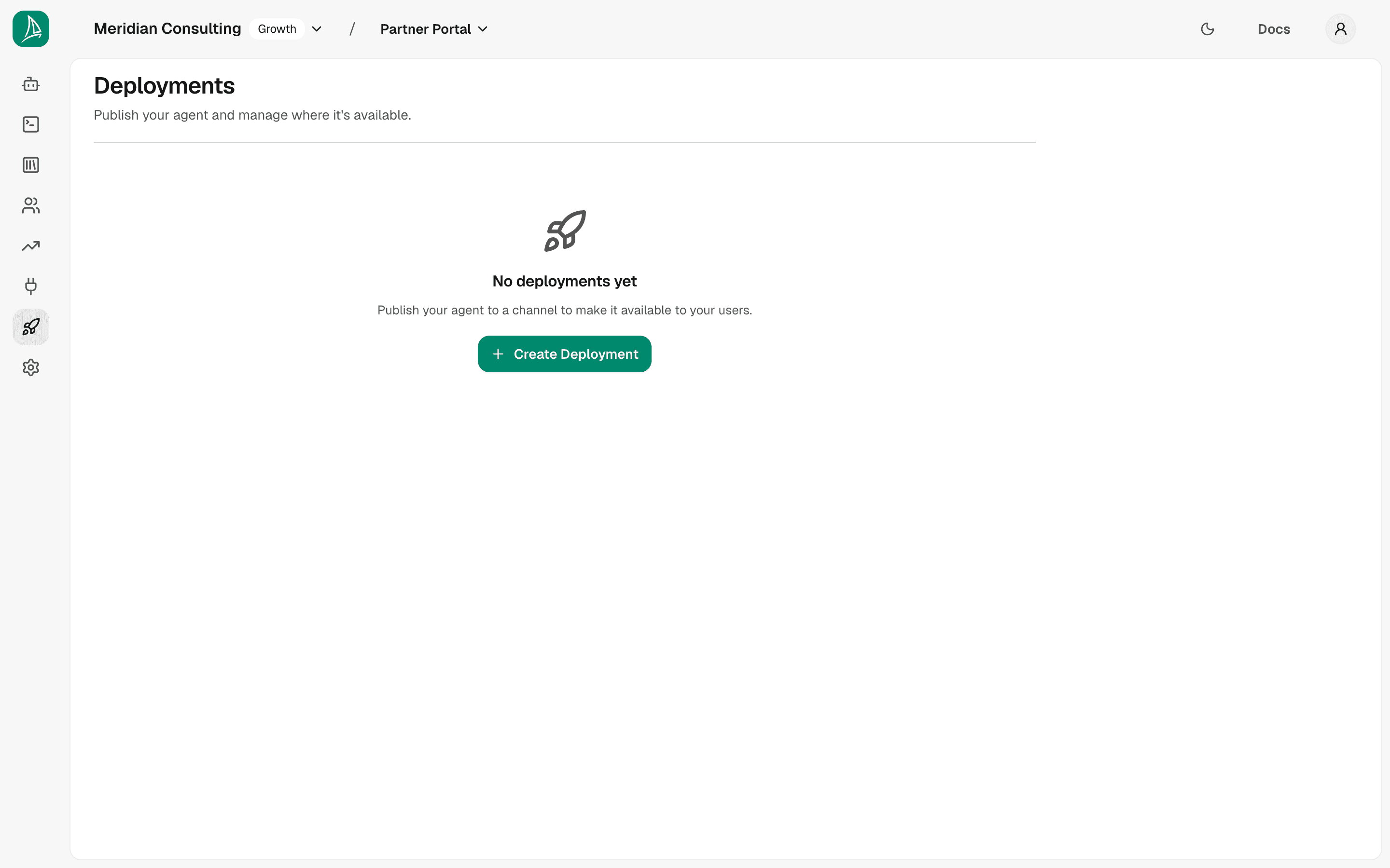
A new team has no deployments. Click Create Deployment to start the wizard.
Step 1 — Basic Settings
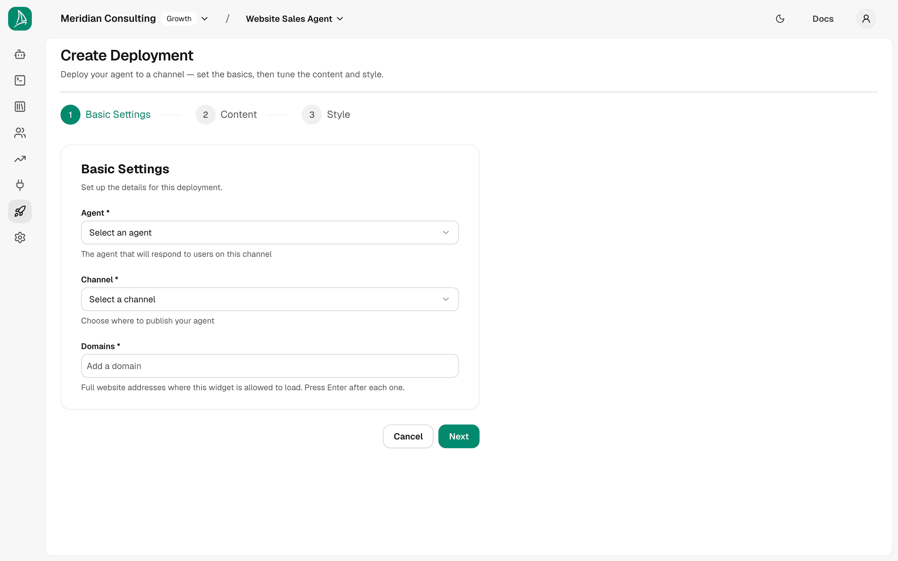
Three fields:
- Agent — the agent that will respond to messages on this deployment. The dropdown lists every agent in the team.
- Channel — where the agent will be published. Currently the only channel is Chat widget; more (Slack, Microsoft Teams, etc.) are on the roadmap.
- Domains — required. The full web addresses where the widget is allowed to load, each starting with
https://(orhttp://). Type one and press Enter to add it; repeat for each site. A domain you've typed but not added with Enter isn't saved. The widget refuses to render on any origin that isn't on this list — it's a security gate, not a hint. Only the scheme, host and port are compared, so one entry covers every page on that site, andhttps://does not coverhttp://.
The screenshot below shows the example deployment configured for the chat widget channel and pointed at a single domain.
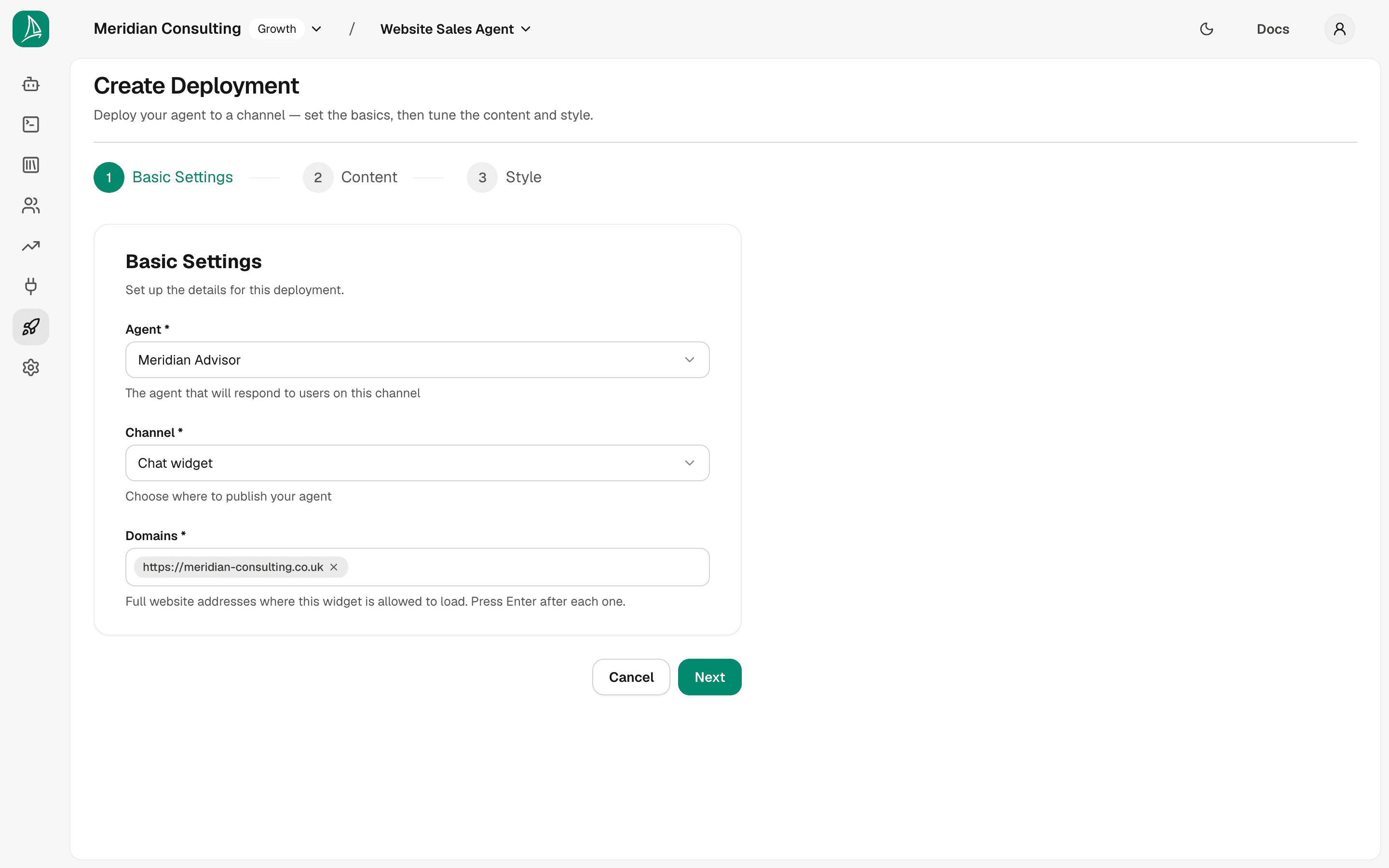
Click Next.
Why domains matter. The widget verifies the parent page's origin against this list before it'll initialise. If the deployment goes on multiple sites — staging at
staging.example.com, production atwww.example.com— list both. If you forget, the widget will silently fail to render on the missing origin and you'll be puzzled.
Step 2 — Content
This is where the deployment's user-facing copy lives. It mirrors the per-agent greeting from Building your first agent but is overridable per deployment — so the same agent can speak slightly differently on different sites.
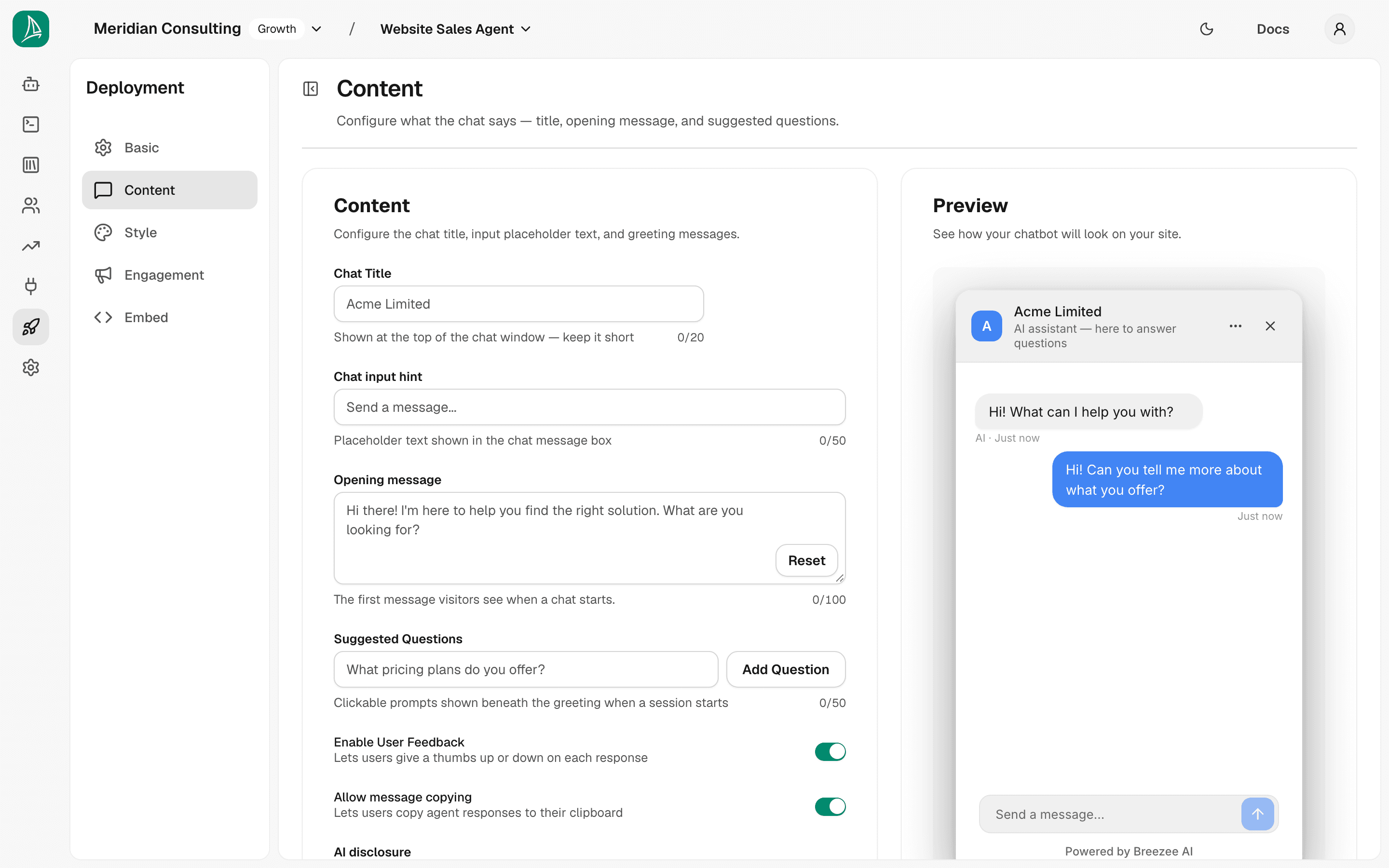
The fields:
- Chat Title — top of the chat window. Up to 20 characters.
- Chat input hint — placeholder text in the message box. Up to 50 characters. We use Ask about services or book a strategy call...
- Opening message — first message the agent sends. Up to 100 characters. It's always a single message — pressing Enter inside it doesn't split it into several. We use the same greeting as the agent default. One exception: when a visitor arrives by tapping a teaser chip, the opening message is not shown at all — see Pick 1–3 chips below.
- Suggested Questions — clickable chips below the greeting. Up to 50 characters each; type one and press Enter to add it. We add three: What services do you offer?, How long is a typical engagement?, Can I book a strategy call?
- Enable User Feedback — thumbs-up/down on agent messages. Default on.
- Allow message copying — copy button on agent messages. Default on.
- AI disclosure — the line shown under the chat title telling visitors they are talking to AI. Up to 80 characters. Leave empty for the default "AI assistant — here to answer questions". You can reword it to match your voice or language, but it cannot be switched off — see AI disclosure below.
- Privacy notice text — dismissible banner above the composer. Leave empty for the default "By chatting, you agree to our privacy policy."
- Privacy notice link — optional URL for a Learn more link.
The Preview panel on the right of the form renders a live mini-widget, at the size the real widget ships, that updates as you type — useful for sanity-checking the copy fits.
The character limits are checked every time you save. Chat Title 20, Chat input hint 50, Opening message 100, each Suggested Question 50, Privacy notice text 50, AI disclosure 80. A deployment created before these limits were enforced can hold longer text — and until that text is shortened, the deployment won't save at all, which includes switching it Active or Inactive from the Deployments list. If a save is refused, check these fields first.
Teasers — the message shown before someone opens the chat
A teaser is the small bubble that appears beside the launcher to invite a visitor into a conversation. You choose them on the agent's Engagement tab.
One teaser per page type. Your site is grouped by what each page is for — see Page type — and each page type has exactly one teaser. There is nothing to choose between and no ordering to get right: the switch turns that page type's teaser on or off. Turning one off does not necessarily mean those pages go quiet — it removes that page type's own teaser, and if Everywhere else is switched on, its teaser takes over there instead. To show nothing at all on a page, its page type and Everywhere else both have to be off.
How a teaser, its chips and its page type fit together
Three things stack up, and each one answers a different question:
- The page type answers where. It is a grouping of your pages, not a single page — every page you have ingested falls into exactly one.
- The teaser answers what we say. One per page type: the bubble's wording.
- The chips answer what they can do next. The buttons under that bubble, 1–3 of them, each handing the conversation to one of the agent's skills.
So a visitor on a product page sees the product-page teaser and its chips; the same visitor on your pricing page sees the pricing teaser and its chips. Nothing is shared between page types — each one carries its own wording and its own pool to pick from, because the useful thing to offer someone comparing two products is not the useful thing to offer someone who has just landed on your about page.
Here is what ships, before you change anything:
| Page type | Teaser | Its default wording | Pool |
|---|---|---|---|
| Pricing | Pricing help | "Not sure which option fits? Tell me what you need and I'll work it out." | 4 chips |
| Product page | Product page help | "Want a hand with this one? I can compare it, check the fit, or book a demo." | 4 chips |
| Contact | Contact shortcut | "Rather not fill in a form? I can arrange it here." | 3 chips |
| Case studies | Case study help | "Wondering if this would work for you? Tell me your setup and I'll say." | 3 chips |
| FAQ | FAQ help | "Can't find your question? Ask me and I'll answer it." | 4 chips |
| Guides / articles | Guide help | "Want this applied to your situation? Ask me anything about it." | 3 chips |
| Product listing | Product finder | "Not sure which one you need? Two quick questions and I'll narrow it down." | 6 chips |
| Audience | Audience help | "Is this your line of work? Tell me your setup and I'll say what fits." | 3 chips |
| About | About page help | "Want to know what we could do for you? Ask me anything." | 3 chips |
| Home page | Home page welcome | "New here? Tell me what you're looking for and I'll point you at it." | 3 chips |
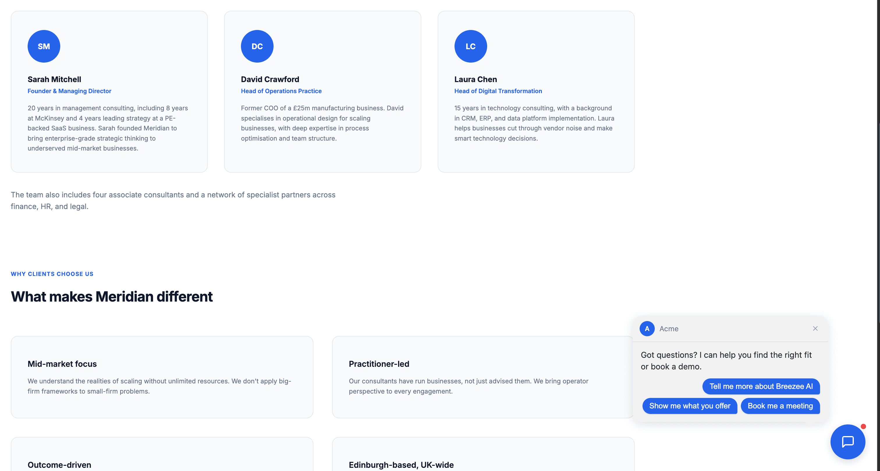
| Everywhere else | General offer | "Got questions? I can help you find the right fit or book a demo." | 7 chips |
Your terms, privacy policy, cookie policy, checkout and account pages show nothing at all — not even General offer. There is no switch for this and nothing to turn on: interrupting someone reading your terms, or part-way through a checkout, is a cost rather than a missed opportunity.
And the pools themselves — you pick up to three from the row that matches your page type:
- Pricing help — Which option is right for me? · What would this cost for my situation? · Can someone talk me through the pricing? · Have someone call me about pricing
- Product page help — Book me a quick demo · Compare {product_name} with {comparable_product_name} · I want to talk to a person · Book me a meeting
- Contact shortcut — Book a time now · Have someone call me back · I have a quick question first
- Case study help — Would this work for my situation? · Do you have examples like mine? · Can we talk about my case?
- FAQ help — I have a different question · Explain this in plain terms · What would you recommend for me? · I want to speak with someone
- Guide help — How would this apply to me? · Explain this in more detail · I want to talk it through
- Product finder — Help me pick the right one · Which of these suits me best? · Can someone walk me through the range? · Have someone call me about this · Book me a meeting · Book me a demo
- Audience help — Would this work for my situation? · Do you have examples like mine? · I want to speak with someone
- About page help — What do you actually do? · Could you help with what I need? · I want to speak with someone
- Home page welcome — Help me find what I need · What do you offer? · Book an intro call
- General offer — Help me find what I need · Book me a demo · I have a question · Put me in touch with someone · Show me what you offer · Book me a meeting · Tell me more about {organization_name}
The braces are fill-ins, and they are ours, not yours. A chip written {product_name} is completed from the page the visitor is on before they ever see it, so it reads "Compare Router X with Router Pro". If the value cannot be worked out — no comparable product on that page, say — that chip quietly drops and the rest of the teaser shows as normal. This is the one place braces are allowed: you cannot type them into your own wording, which stays plain text.
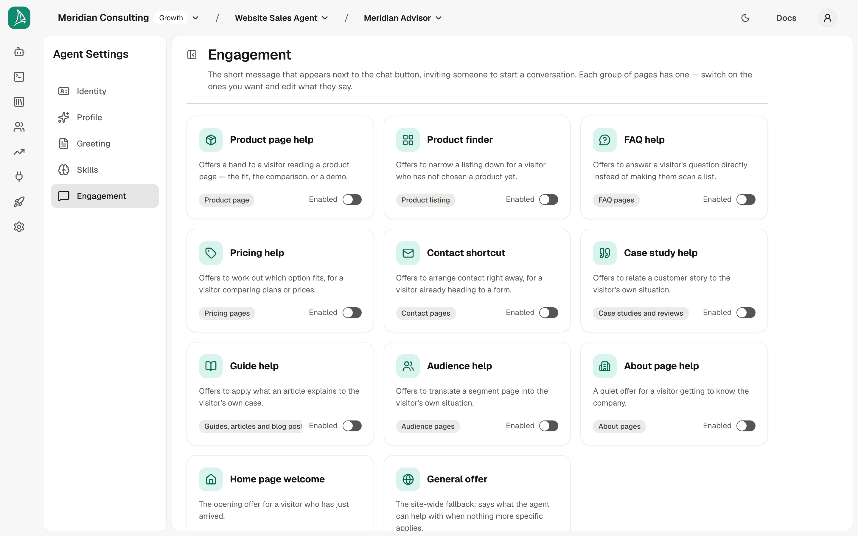
The tab is a grid of cards, like Skills. Each card names its teaser, shows the icon for its page type, and says what it is for; the badge underneath names the page type it fires on. The switch on the card turns that teaser on or off. Click anywhere else on the card to open that teaser's own page, which is where its wording and chips live.
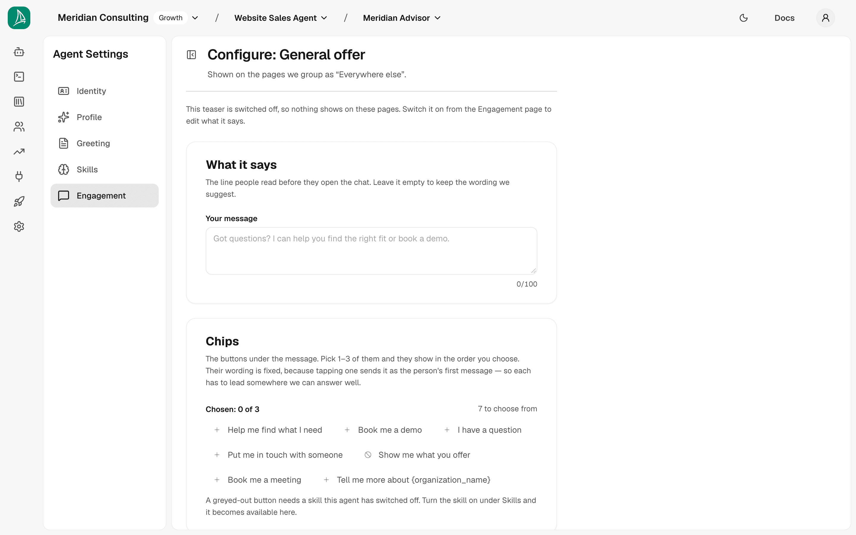
Configuring a teaser. The configure page holds two things: What it says and Chips. Switching a teaser on and off stays on the Engagement page, where you can see all of them at once — so if you open a teaser that is switched off, the page tells you and both sections stay locked until you turn it on.
Teasers have names, and names don't change when you reword them. Each teaser has a fixed name — Product finder, Product page help, General offer. Reword its message as much as you like — the name stays put, so the same teaser is recognisable on the Engagement tab and in your analytics even after you have rewritten its copy. Reset puts the original wording back.
Your wording is capped at 100 characters. A teaser is a small bubble beside the launcher — a few short lines on a phone. Past that it either clips or grows tall enough to cover the page it is inviting someone to read, so the editor stops accepting characters at the limit and shows a live count as you type. Your wording is plain text — there are no fill-ins like the product's name, and anything you type in {{double braces}} is refused rather than shown to a visitor as-is. The Preview underneath the box is exactly what they will read.
Pick 1–3 chips from the teaser's pool. Every teaser offers a set of tappable buttons, and you choose up to three of them, in the order you want them shown — the whole pool sits side by side as chips, with the ones you have picked first and numbered in the order they will appear. The wording is fixed — a chip is sent as the visitor's first message, so it has to route somewhere reliable. Most chips in a pool do something genuinely different, and a few are the same thing said another way: Book me a quick demo and Book me a meeting both book a meeting, so pick whichever your visitors would actually say. Once three are picked, adding a fourth means removing one first.
A chip tap opens the conversation on the chip itself. The agent says nothing above it: neither the deployment's opening message nor the teaser's own wording is replayed. The visitor read the teaser outside the widget and answered it by tapping, so there is nothing for the agent to say above a question already asked — the chip is the conversation's first line, and the reply comes straight back to it. Tapping the body of the bubble rather than a chip is different: the whole bubble is tappable, so it opens the widget, but it sends nothing and types nothing — the composer is empty and the conversation opens with your opening message as normal. The teaser's own wording is never put in the visitor's input box: it is the agent's line, not theirs.
Hover a chip to see where it goes. Every chip hands the conversation to one of the agent's skills, and the tooltip names that skill exactly as the Skills page names it — Product Finder, Advisory Guidance, Book Meeting. This is worth using: because two chips can route to the same skill on purpose, the wording alone does not always tell you. It shows on any chip, picked or not, and on greyed-out ones too — which is how you find the skill you need to switch on.
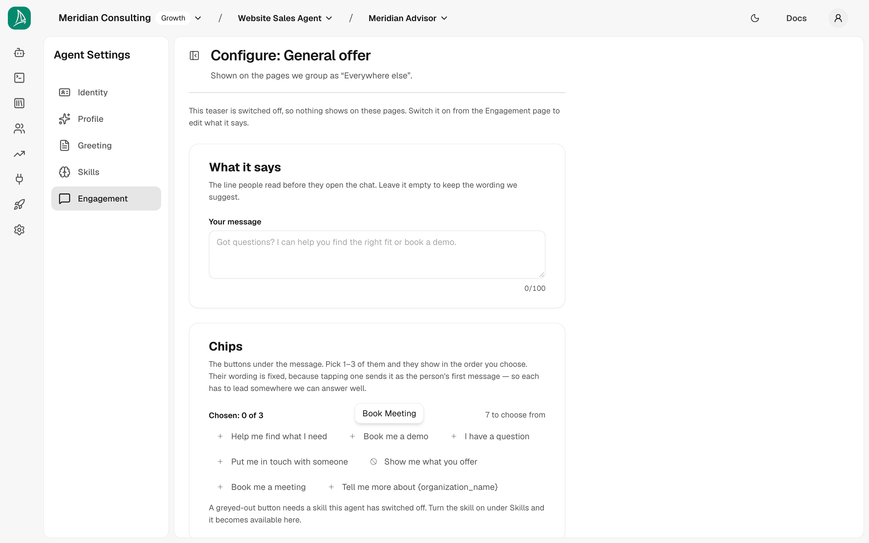
A chip needs its skill switched on. Each chip hands the conversation to one of the agent's skills — booking a meeting, giving advice, putting someone in touch. If that skill is switched off for this agent, the chip is greyed out and cannot be picked, and a line at the bottom of the section says so. Turn the skill on under Skills and the chip becomes available. If a skill is switched off after you picked its chip, the chip is marked in red so you can see it will not show, and you can remove it even if it is your only one.
"Everywhere else"
The last page type is called Everywhere else, and it is worth understanding precisely. Its teaser runs wherever no other page type's teaser ran:
- on pages that match none of the page types above it;
- on page types you have left without a teaser.
That second line is the one people are surprised by: switching Product page off does not silence your product pages, it hands them to Everywhere else. That is usually what you want — a general invitation beats none — but if you meant those pages to show nothing, switch Everywhere else off too.
It is not "everywhere". A page type teaser always wins on its own pages, so Everywhere else only ever fills the gaps.
When the teaser appears
Choosing teasers is an agent decision; whether they fire at all, and how soon, is a deployment one. That lives on the deployment's own Engagement page — see The Engagement page below.
Where page types come from
Every page type is decided by reading the page itself when it's imported — never by guessing from its web address. A pricing page at /subscription is still recognised as a pricing page. See And what each page is FOR for how that works.
If a page is showing the wrong teaser, the fix is on the Content page — correct how the page was classified there, and everything that reads the classification is fixed with it, not just teasers.
Click Next.
Step 3 — Style
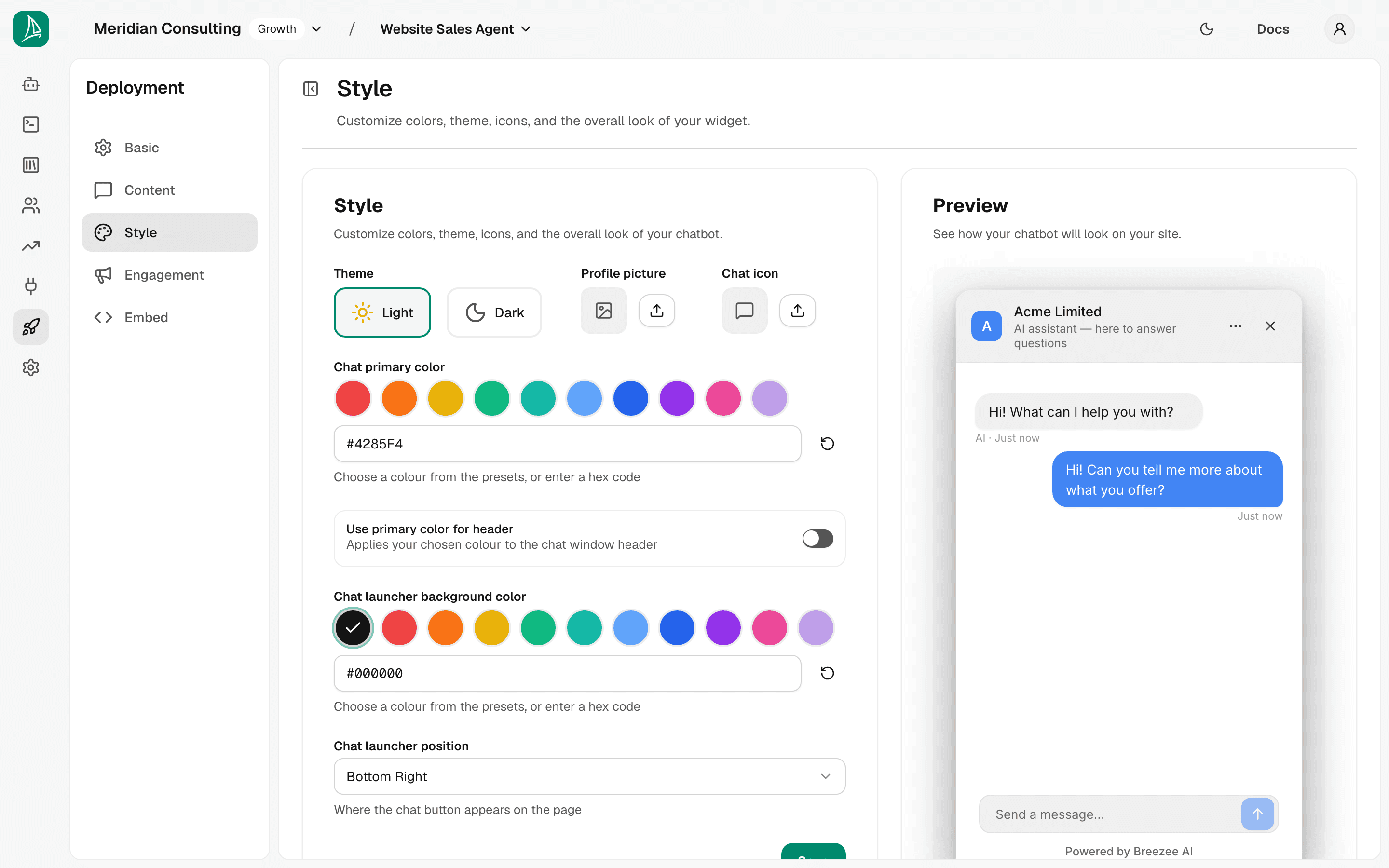
This controls the widget's visual presentation:
- Theme — Light or Dark mode for the chat surface.
- Profile picture — the agent's avatar.
- Chat icon — the icon shown on the launcher button.
- Chat primary color — colour swatches (Red, Orange, Yellow, Green, Teal, Light Blue, Dark Blue, Purple, Magenta, Lavender) plus a hex input for arbitrary brand colours.
- Use primary color for header — toggle. When on, the chat window header uses the primary colour rather than the theme default. Recommended on — it ties the widget visually to your brand.
- Chat launcher background color — the colour of the floating chat-bubble button on the page itself, with its own preset row plus hex input. Defaults to black.
- Chat launcher position — Bottom Right (default), Bottom Left, etc.
Pick colours that match your brand. The Preview panel reflects the choices in real time. Keep Use primary color for header on if your brand colour reads well as a header — it ties the widget visually to your site.
Click Create Deployment. The platform provisions the deployment and lands you on the Embed page.
The deployment's standalone settings pages
After creation the deployment has its own sub-navigation in the left rail with five pages — Basic, Content, Style, Engagement and Embed. Four of them are standalone editors for the corresponding wizard step; Engagement has no wizard step, because a teaser is worth setting up only once the deployment exists. The wizard is the green-field creation path; the standalone pages are how you tweak settings later.
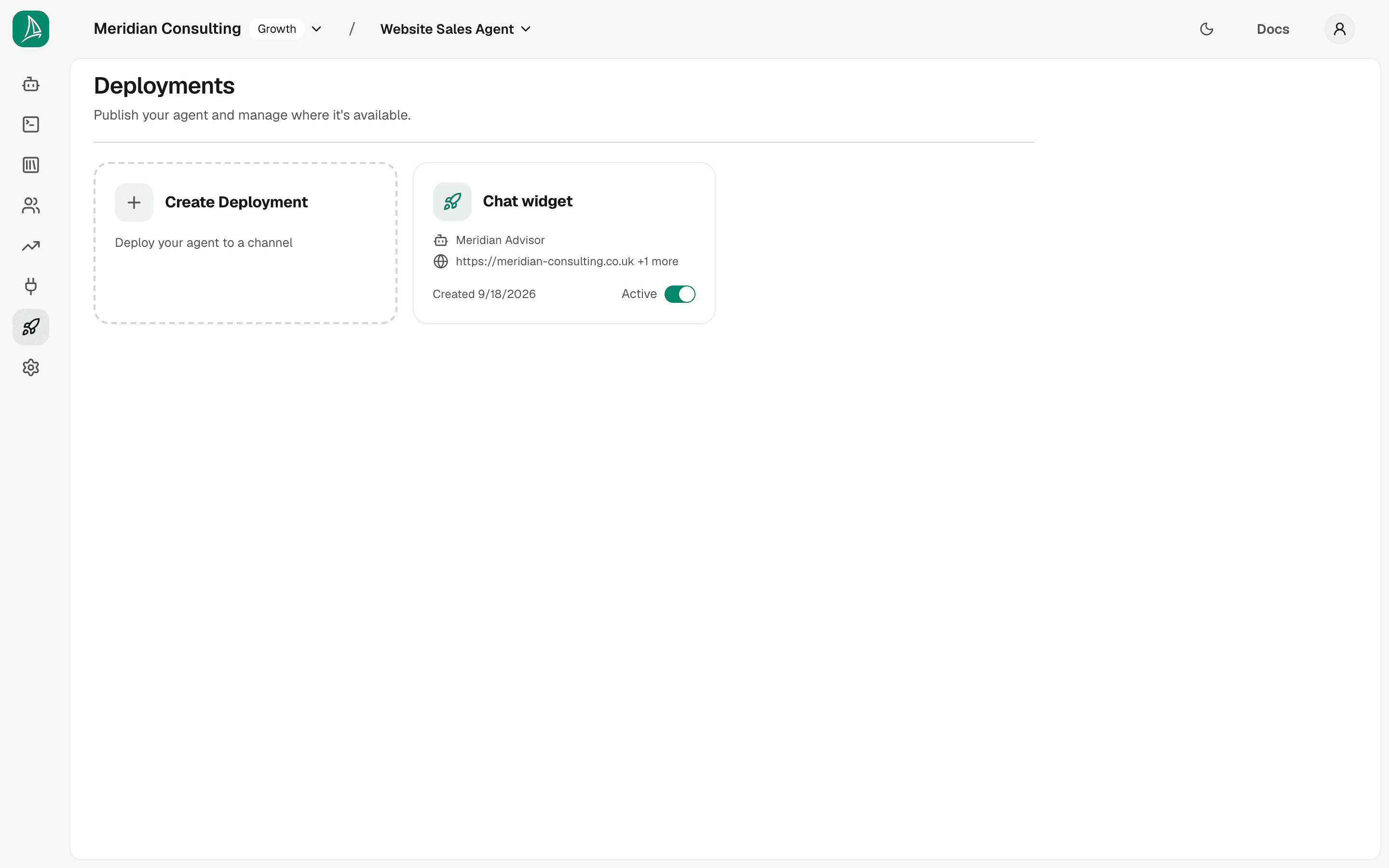
Each deployment in the list shows its channel, its agent and first domain, and an Active / Inactive switch. Click anywhere else on the tile to open the deployment and edit its configuration.
Switching a deployment to Inactive stops it answering. A widget left open on a page that belongs to an inactive deployment can't continue its conversation. Switching back to Active needs a plan that includes deployments; switching to Inactive is always allowed.
The Engagement page
Engagement in the deployment's left-hand sub-navigation is where you decide whether this deployment shows a proactive teaser at all, and when.
It is worth being clear about the split, because the word Engagement appears in two places. The agent's Engagement tab decides WHAT is said — which teaser each page type shows and which chips sit under it, shared by every deployment of that agent. This page decides WHETHER and WHEN, for this deployment only. The same agent embedded on a fast-moving marketing site and on a long-read documentation site wants the same wording and different timing, and that is exactly the seam.
Getting there. Open the deployment from the Deployments list and pick Engagement in the sub-navigation, or go straight to it — the URL is the deployment's own path with /engagement on the end. Use Deployments in the left-hand rail to get back to the list.
The page holds one card, Proactive engagement.
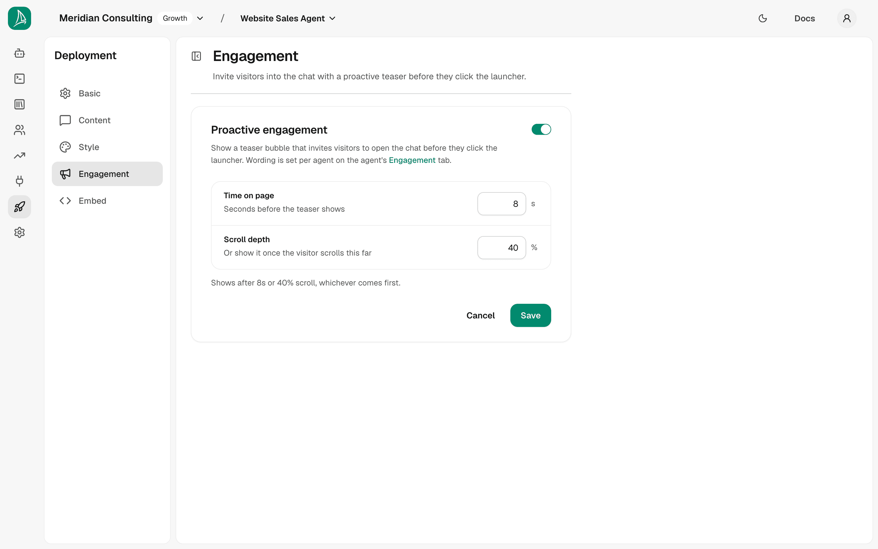
The switch in the card header is the master control for this deployment. With it off, no teaser appears anywhere, whatever the agent's Engagement tab says.
With it on, two gates decide the moment:
- Time on page — Seconds before the teaser shows. How long someone has to linger.
- Scroll depth — Or show it once the visitor scrolls this far. How far down they have to get.
Each sits on its own row with the number and its unit (s, %) on the right.
Whichever happens first wins. They are not conditions to satisfy together: someone who scrolls straight past your threshold sees the teaser immediately without waiting out the timer, and someone who reads the top of the page without scrolling sees it when the timer runs out. The line under the fields reads the two numbers back as the one sentence they add up to — with the defaults, "Shows after 8s or 40% scroll, whichever comes first." — so you can check the behaviour without doing the arithmetic yourself.
A gate of zero is not "no delay", it is "no gate". Zero is already satisfied the instant the page loads, so setting either one to 0 makes the teaser appear straight away regardless of what the other says. The read-back line says so in as many words — "Shows as soon as the page loads, because one of the two gates is set to zero." It is occasionally what you want; it is more often a typo.
Choosing a time. Defaults are 8 seconds and 40%, which suit a typical marketing page. Two things to weigh:
- Too early reads as an interruption. Someone who has been on the page for two seconds has not decided whether they want anything yet, and a bubble arriving mid-sentence is the most common reason a teaser gets dismissed rather than tapped.
- Too late is never. If your pages are usually read for fifteen seconds, a thirty-second delay means the teaser is shown to almost nobody — and the Teasers table in Analytics will show it as a low Shown count rather than a copy problem.
The scroll gate is the useful half on long pages, where someone genuinely engaged reaches 40% well before any sensible timer expires. On a short page they may never scroll at all, and the timer is what fires.
The delay accepts up to 120 seconds and the scroll gate 0–100%.
Cancel and Save sit below the card, right-aligned under a dividing rule — the same row every other deployment page uses, so saving works the same way wherever you are in a deployment. Save reads Saved while the form matches what is stored, so the button tells you whether you have unsaved changes; Cancel puts the stored values back.
There is nothing else on this page. Teaser wording, chips and page types are all on the agent's Engagement tab — this page is only the switch and the timing.
The Embed page
This is what every deployment exists to produce: the snippet you paste into your site.
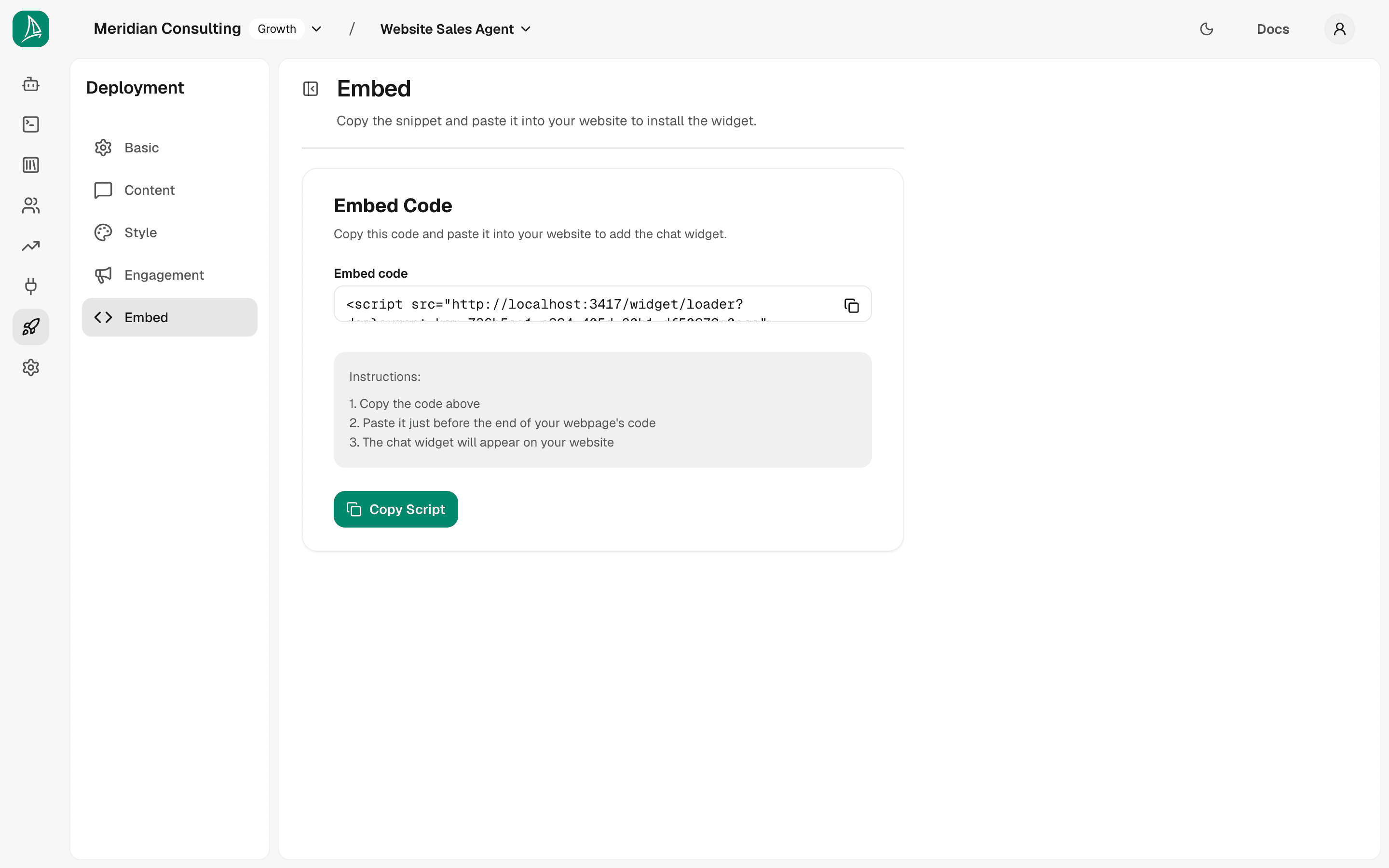
The snippet is a single <script> tag containing a unique deployment_key. Example:
Production note. In a real tenant the loader URL points at your production dashboard host, not
localhost:3000. The deployment we created here is for the manual's local development environment, so the snippet is bound to localhost. If you embed a localhost-bound snippet on a public HTTPS site, browsers will block the script with a mixed-content error — and external visitors can't reach your laptop anyway. Use the deployment whose loader URL matches the dashboard environment that will be live in production.
The two instruction steps
- Copy the snippet.
- Paste it just before the closing
</body>tag of your site (or anywhere late in the page — order doesn't matter for the widget's behaviour, it just affects when in page load it initialises).
That's it. No further configuration is needed in the website code. Everything about the agent — greeting, skills, nudges, theme, allowed domains — is held server-side and identified by the deployment key.
Putting the widget on the live demo site
For this manual the snippet is on a demo page for Meridian Consulting, the example business the manual follows. Once the snippet is on a page, visiting it shows the chat launcher pinned to the bottom-right corner.
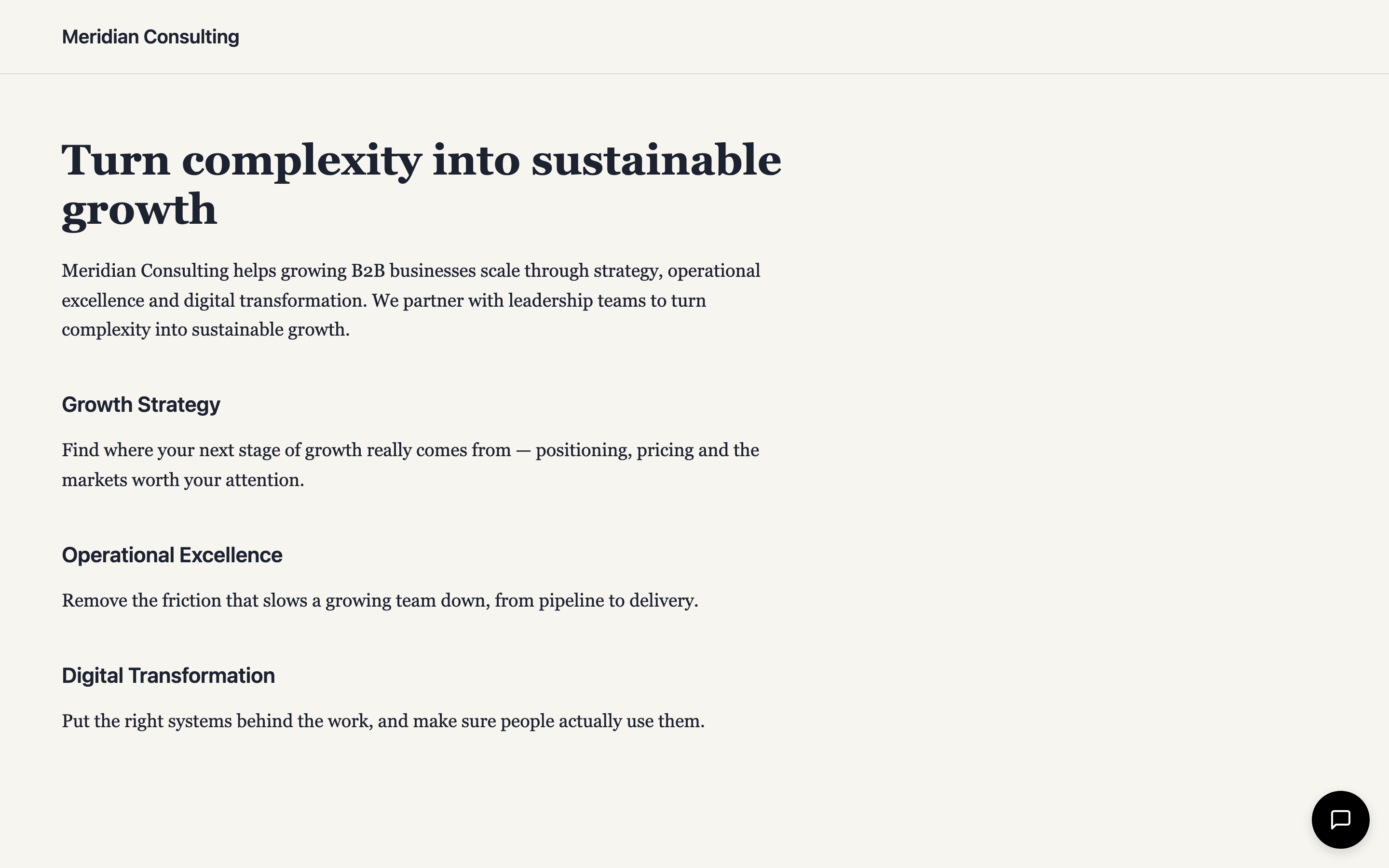
The launcher is the round button in the bottom-right, in the launcher background colour from the Style step. Everything else on the screen is the host page itself. The chat opens in an iframe positioned over the page; it can be open or minimised but doesn't otherwise interfere with the host site.
Opening the widget
Click the launcher. The widget expands into a panel with the chat title, the AI disclosure line beneath it, the greeting, the suggested-question chips, the privacy notice banner, and the chat composer.
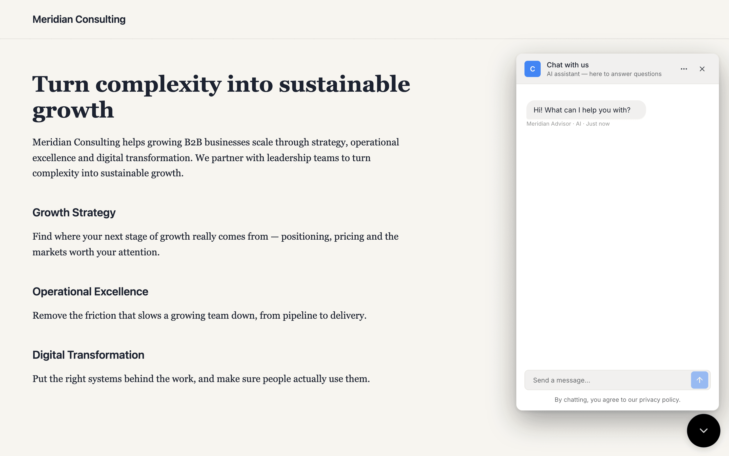
Notice four things:
- The header's colour comes from the Style step — with Use primary color for header on, it takes your primary colour; off, it follows the theme.
- The Chat Title matches what was typed in the Content step.
- The AI disclosure sits directly under the Chat Title, in smaller muted type — see AI disclosure below.
- A privacy notice sits just above the composer — the platform's default text, dismissible by the visitor.
AI disclosure
Under the chat title, the widget always shows a short line identifying the assistant as AI — by default "AI assistant — here to answer questions".
This is there for legal reasons. Article 50(1) of the EU AI Act, which applies from 2 August 2026, generally requires that people are informed they are interacting with an AI system at the point of interaction — unless that is obvious to a reasonably well-informed, observant and circumspect person given the circumstances and context, and subject to the Act's other exceptions. Where disclosure is required, burying it in terms and conditions is not enough. California's bot-disclosure law (BPC §17941) is narrower: it targets using a bot to communicate with someone with the intent to mislead them about its artificial identity in order to incentivise a sale or transaction, or to influence a vote.
Rather than assess "obviousness" per deployment, the widget always shows the line. Treat this section as a description of the feature, not as legal advice — confirm your own obligations with your legal adviser.
Two consequences for you:
- You can change the wording. Edit the AI disclosure field in the Content step to match your voice, your brand, or your visitors' language — for example "Acme's AI assistant — I can answer questions or book you a demo".
- You cannot switch it off. There is no toggle. If you clear the field, the platform default is used instead — the line never disappears.
The disclosure is deliberately worded around what the assistant can do rather than as a warning. Research on bot disclosure found that an apologetic, warning-style framing significantly suppresses engagement, while a capability-framed one does not — so keep any rewording positive and specific.
The line is persistent: it stays in the header for the whole conversation, and is still there if the visitor returns to a resumed session. It is separate from the privacy notice above the composer, which does its own job and remains dismissible.
Sending a message
Pick a suggested question — for this run, What services do you offer? — or type freely. The agent responds:
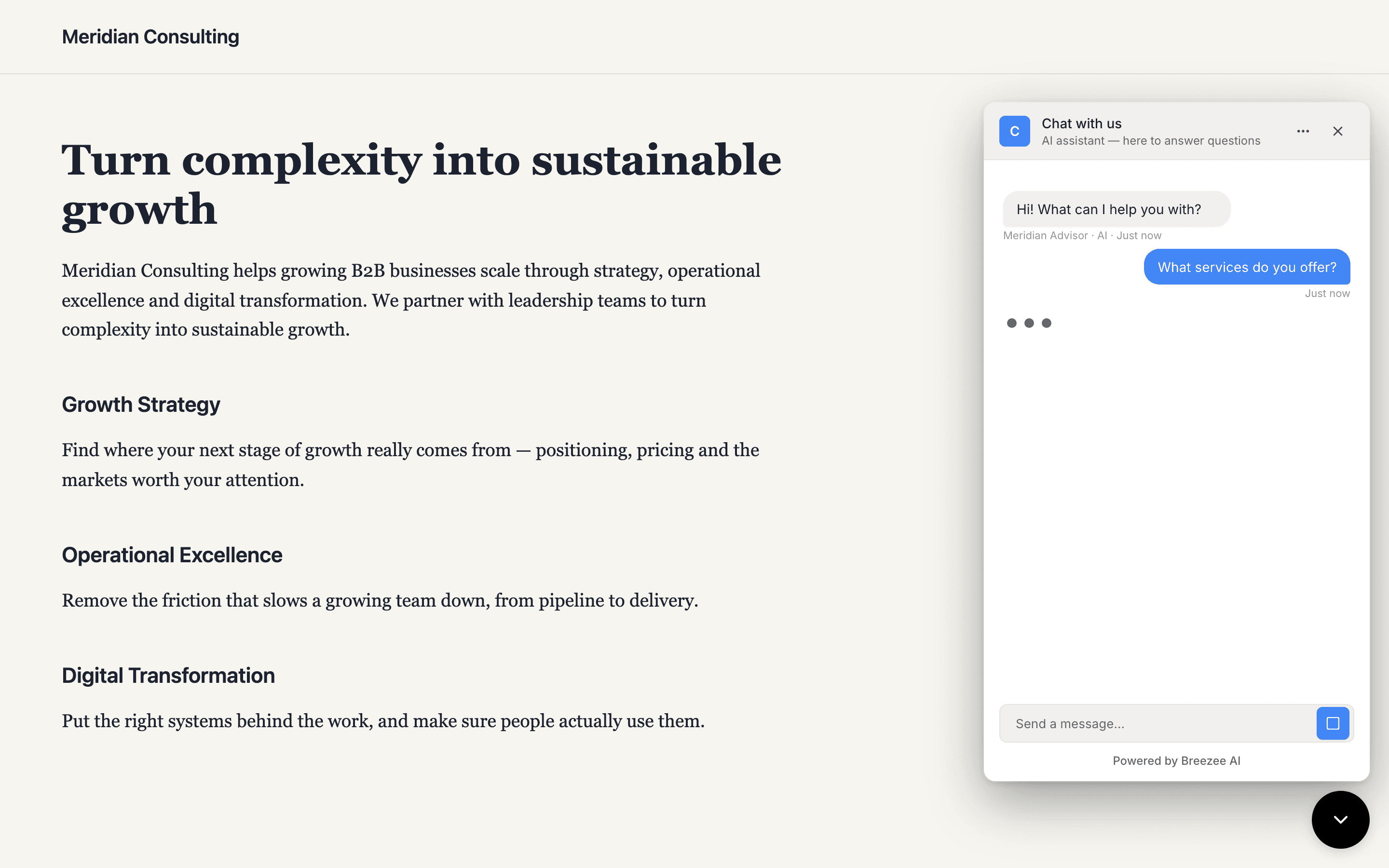
The reply draws on the content uploaded in Ingesting knowledge, summarises it, and offers to narrow further. The visitor experience is identical to the playground — the only difference is they're on your customer's website rather than your dashboard.
What's coming through the widget's GDPR flow
The widget's GDPR consent flow works the same way as in the playground:
- The privacy notice is shown by default and can be dismissed.
- After four messages, or immediately after a visitor submits details (booking, contact form), the widget asks whether it may remember them — Yes or No.
- The visitor accepts or declines per session, and the answer decides one thing: whether a marker is kept in their browser, so they are recognised when they come back. Everything else — what they submitted, what the agent works out, the lead score and the session summary — reaches you either way.
- A Manage data menu is always reachable from the widget's menu icon (the three dots in the chat header); from there the visitor can review what's stored about them and request erasure.
The deployment doesn't have separate GDPR configuration — the behaviour is baked into the widget runtime and respects the per-visitor consent state in their browser's localStorage. If a visitor declines on one session and returns later, they're still declined until they actively change that.
Multiple deployments per agent
A single agent can power multiple deployments. Common reasons:
- Multi-brand. The same agent backs a primary brand site and an acquired sub-brand site, each with its own colours and copy.
- Multi-region. Different opening messages and suggested questions per locale.
- Staging vs. production. The same agent in two environments, with the staging deployment locked to a
staging.example.comdomain. - A/B testing. Two deployments of the same agent with subtly different greetings, embedded on different traffic slices.
Each deployment carries its own embed snippet, allowed domains, and content/style — but inherits the agent's skills, nudges, and content. Changes to the agent propagate to all of its deployments instantly.
What's next
The widget is live and answering questions. From here on the manual covers what happens because the widget is live — prospects, analytics, and integrations.